DisasterGuard
Creators: Emir, Sofia, Sheily, Marjory
School: High School Students from Mouse Design League (DIIT) @ High School for Environmental Studies

About this Project
Our app was inspired by the recent earthquake in Turkey and Syria. It was a very important issue that caught our attention, and we became very interested in finding a way to help those from afar, especially because there is nothing to prevent most of these disasters.
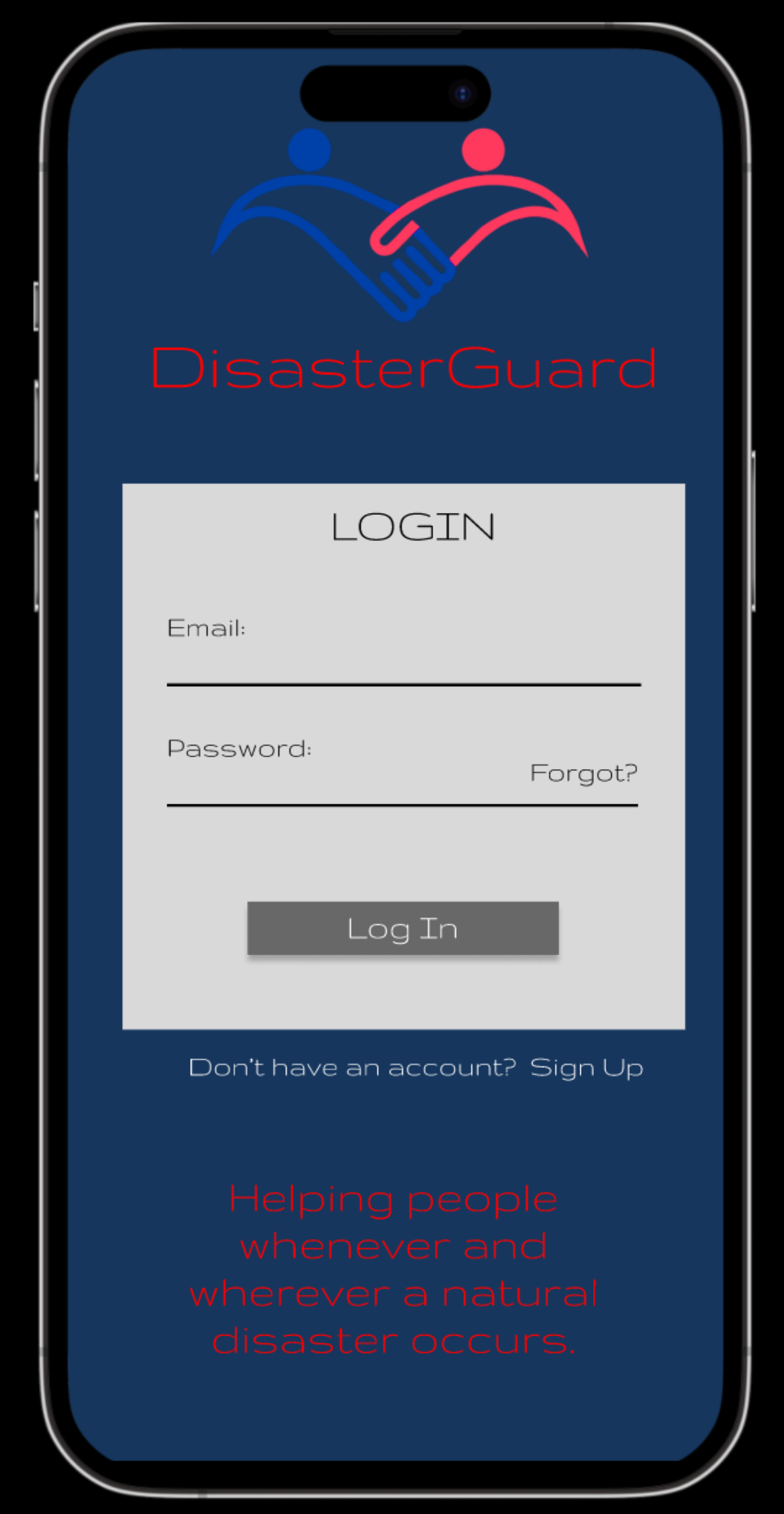
To create our app, we interviewed students and teachers in our school. Then we brainstormed ideas and created a 3-panel storyboard to describe our app. We also created a paper prototype and a wireframe using Figma. Finally, we made a mockup of our app.
This app includes a live map that directs users to the closest shelter or escape point. It also provides a what-to-do guide for several different disasters and a donation page for those who are interested in helping as well. Lastly, an alert button will be on the homepage that is connected to your current location and will alert local rescuers. The app also can be used by users who want to donate and help people affected by any natural disaster, even if they aren't in the affected area. In the donation section, there will be a list of websites where people can donate any amount of money, clothes, food, etc. Users can also interact with a chatbot to get more information about what to do during the disaster.
Project Links
Take a Closer Look
What the Judges are Saying
Overall, your pitch demonstrates a clear motivation for developing the app and highlights the problem you aim to address. It's great that you conducted interviews and utilized different design tools to create a comprehensive app concept. Here are some specific feedback points:
Emphasize the Unique Value Proposition: While it's mentioned that the app helps users find shelters, provides disaster guides, and facilitates donations, it would be beneficial to highlight the unique features or advantages that set your app apart from similar solutions. What makes it stand out in terms of usability, accuracy, or effectiveness?
Expand on the Alert Button: The inclusion of an alert button connected to the user's location is a crucial feature. Consider expanding on how it works, such as the specific emergency services or rescue networks it notifies and how it ensures user safety.
Address Security and Privacy: Given that the app will be using location data and potentially sensitive user information, it's essential to mention how you prioritize security and protect user privacy. Assure potential users that their data will be handled responsibly and adheres to relevant (local) data protection regulations.
Data Sources: One very crucial topic needs to be addressed, which is about getting the actual data about disasters, shelter and so on. This is probably the most critical point which needs to be clarified.
By addressing these points, you can strengthen your pitch and provide a clearer understanding of the app's purpose, target audience, unique features, and potential for impact.
This is a great idea! I can see this being a useful app for anyone to use, whether they are in a disaster-prone area or not with the options to donate and learn about what to do during a natural disaster. I think it is also cool to be able to see how far away you are from a disaster and possible evacuation routes/ shelters someone can relocate to.
A few pieces of constructive feedback: The color scheme of the app is a bit dark. The action of the alert button is also a bit unclear; who is it altering? Does it make your phone ring an emergency number like 911? On your Donations page, it lists a few major organizations; are there options for people to see/search/add smaller or more local organizations to donate to?
A few pieces of constructive feedback: The color scheme of the app is a bit dark. The action of the alert button is also a bit unclear; who is it altering? Does it make your phone ring an emergency number like 911? On your Donations page, it lists a few major organizations; are there options for people to see/search/add smaller or more local organizations to donate to?
Great job building a tool that serves a vital humanitarian need. You clearly articulate the growing global humanitarian crises that continue to occur more frequently. And, the simplicity of the interface allows users to quickly identify solutions that can save lives.
How could the app integrate with other organizations on the ground? How could you use push notifications or alerts to help users get the info they need? Given that these crises can often trigger moments of panic and lack of clear mindedness, how could the app be more accessible for emergencies, similar to iPhone's emergency call system.
Regarding the UI, I think there could be a way to differentiate between emergency situations and non-emergency situations. The donate button would be a crucial distraction in the event of an emergency. Are there ways to connect your app to other organizations' data & tools? For example, US Geological Survey or UN Office for Disaster Risk Reduction. Your app could be a launchpad to get the best response data.
Congrats on all of your hard work!
I loved your work and the usefulness it would have in the context of natural disasters. I believe the picth refers in a very synthetic and clear way to your motivations, and the description of your design process and the stages your prototype went through are very well demonstrated. Given the great use that this app would have, I believe that there are still risks. The Alert Button is clearly something innovative in this area, but it can generate false positives if, unintentionally or by accident, the user triggers it. Even so, I would keep the button because it promotes something very difficult to achieve in a moment of disaster and mental bewilderment: speed of action. The existence of a map makes the perception of what is happening visual, which is good. It would certainly have a great social impact. To a certain extent, the implementation of this idea could also go through a model similar to apps to track Covid-19, but their specifics would have to be well analyzed, and this is not the space for that. The work is great, you have developed something that can be applied in the future and I loved your project!


