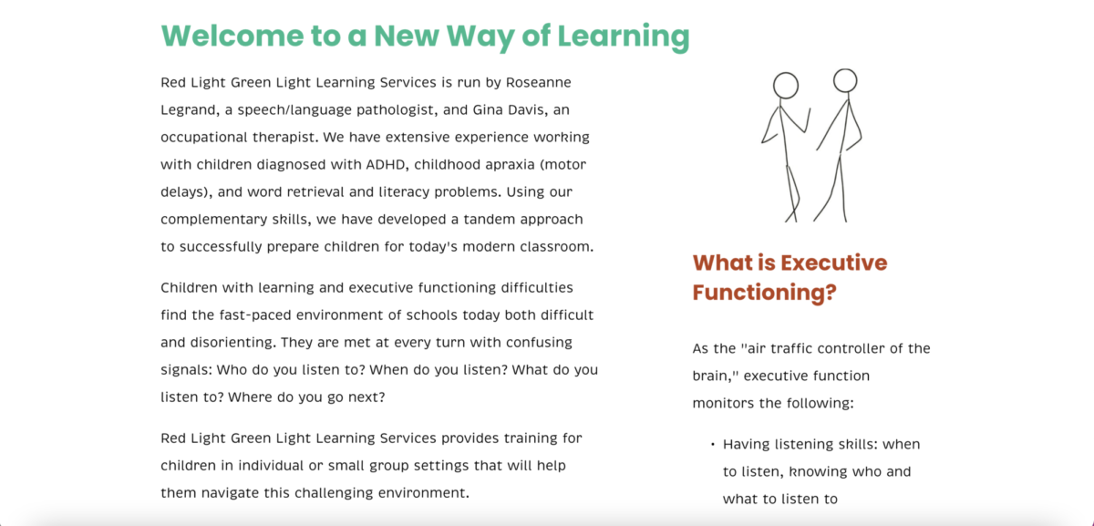
Red Light Green Light Learning Services Website + Illustrations
Creators: Meghan, Christian, Jason, Sean, Nolan, Saumya, Tate, Flynn, Justin, Pablo, Daniel S., Jared, and Daniel C.
School: High School Students from Tech Kids Unlimited

About this Project
The TKU Digital Agency was hired to create a new, modernized website for Red Light Green Light Learning Services. The clients requested an updated website to speak to their maturing demographic of high school students and their families, as they use a tandem approach to building executive functioning skills with language therapy with occupational therapy. Using SquareSpace, the designers created a new website with six main pages: Home, Our Services, About Us, Testimonials, Resources, and Contact Us.
In addition to the website design, the Digital Agency designers created accompanying illustrations that showcase the outcomes of the learning services offered by the client, in a simplistic and compelling style.
The process of creating these digital products and assets was iterative in nature and strongly based in direct client feedback.
Take a Closer Look
What the Judges are Saying
Very nice web designing and content. Excellent work by the entire team. I am pretty sure TKU will do a fantastic job in redesigning many more websites in future.
Good illustrations are used and I like that the contact info is at the bottom of each page!
Good illustrations are used and I like that the contact info is at the bottom of each page!
Great work in redesigning the website! It seems much less cluttered and enjoyable to look at than it was before! I especially like the simple line drawings used to add imagery to the website. They give the site a lot of personality and reflect the playful nature of the work that the therapists do.
I noticed there is quite a lot of text to read on each page. As a next step, you might want to think about further cutting down this text, while increasing the amount of images! You can think about questions like: does some of the language on one page mostly repeat what's on another page? Who are the site's typical visitors and what do they really want to find out when they click on each page? Are they able to find that information easily, or is it hard to find because there is too much other text? Making further updates based on answers to these questions could make the website an even better experience for visitors!
That said, what you have is a really great start to a redesign, and I hope you continue to work on it! I'd love to see the final site once it's done.
TKU Digital Agency - lovely job on the website redesign. I loved how you made the look and feel of the site very clean and streamlined the colors. The site navigation was easy to follow. The illustrations are a beautiful touch and really brought Red Light Green Light's services to life. Incredible work and can't wait to see the final site!
Wow! You definitely made the site look clean and modern and readable! Excellent work!


